
Component
A Component is a saved piece of a Page that you can reuse, such as a product card, navigation bar or signup panel. Link it into several Pages when they should follow the same design, or copy it when you want to change it independently.
How reusable Components work
A Component saves its element tree, text, appearance, data settings and interactions. It opens in the same Story editor as a Page. A linked copy on a Page follows changes to that saved Component; individual properties can also be changed just for that placement.
Copying a design keeps its selected data source. It gives you another design to edit, while both designs continue to read the same records. Include the sources when exporting a Model for another workspace.
Save a product card as a Component
Save an existing card when you want to reuse its design on another Page.
To start independently, choose Create → Component in an Organizer folder's menu. In Components, choose the first element, such as Div, then insert its children. A Component can use a Div as its root; choose a root that fits where you intend to place it.
- Build a card on a Page. For example, insert a Div containing a Heading and Paragraph.
- Name the Div Desk lamp card. Put Desk lamp in the heading's Plain Text and €40.00 in the paragraph's Plain Text.
- Open the Div's tree menu and choose Save as Component.
- In Save Component to, select the destination Organizer folder.
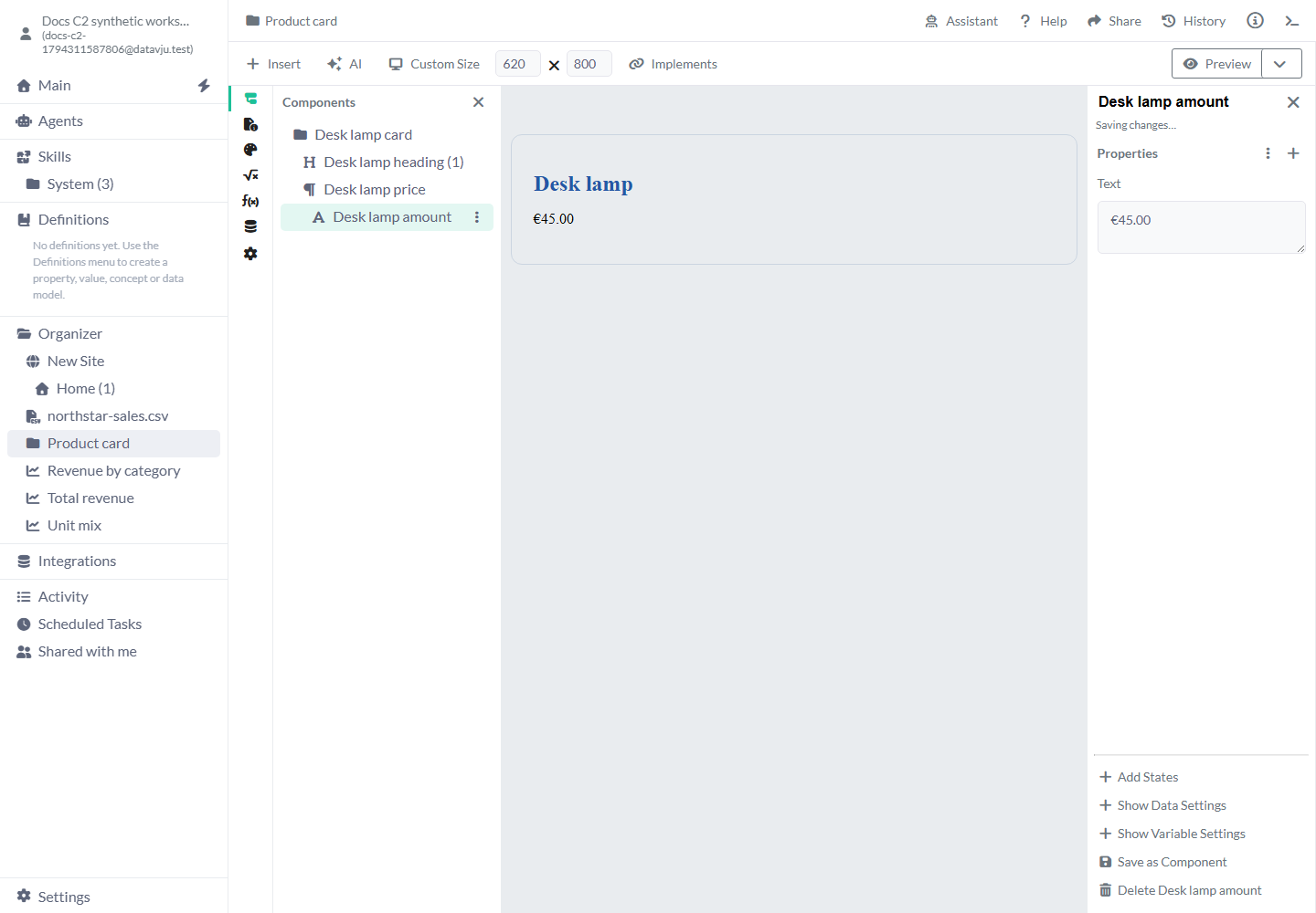
- Find the saved item in Organizer and rename it Product card. Open it to inspect the saved root and children.
Insert a linked Component
A link follows the saved Component when you edit its source.
- Open the destination Page and select the parent that should contain the Component.
- Open Insert, then All Components. Find Product card in the Component Library.
- Choose Link Product card… to insert a linked copy.
- Close the explorer and inspect its position on the canvas.
- Open the saved Product card, edit its amount to €45.00, then return to the Page. Its linked copy shows €45.00.
Choose a link or an independent copy
Choose whether this placement should follow source edits or have its own design.
- Link: follow future edits to the saved Component. Use it for a shared navigation bar or card layout.
- Copy from the Component Library: add a design you can change independently. Use it as a starting point for a special campaign card.
- Copy and Paste in the tree: select the copied element's new parent before pasting. Children and their settings come with it.
- Copy to Clipboard and Paste from Clipboard (component): move a copied design through Organizer. Keep access to its selected data and nested Components.
Change one placement
Select the linked Component itself to change its root appearance, such as Display, Color or a shared Style. The change applies to that placement.
To change an element inside it, select that element and choose Add Instance Property. Choose the property you want to override and enter its value. Show Data Settings and Show Variable Settings make the corresponding controls available. The original element name and inherited values stay read-only; edit the saved Component when all linked copies should change.
Remove the local property override to return to the source value. For a different Dataset, replace the placement's Dataset and select the matching fields for its affected properties. Check both this placement and another linked copy afterward.
Read rows for the current Page
In Data Settings → Query conditions, compare a Text field with Current Locale, Current Path or Current Path → Segment. The server selects matching rows before sending data to Preview or the published Page. A reusable Component uses the Page containing it.
Current Locale is the language tag from the Site locale system. Current Path is the routed pathname including its language prefix, without host, query string, fragment or trailing slash. Segment is the last part, such as overview in /nb-no/docs/overview. A missing match returns no rows; missing Page context reports an error.
For a localized article, compare its Locale field with Current Locale and its ArticleSlug field with Current Path → Segment, joined by and. Check each language in Preview, then publish. Existing access rules still apply.
Component settings
The root controls the reusable piece as a whole; each element inside it has its own content and appearance.
- Name: a descriptive tree name helps you find an element. A newly saved Component may have a generic Organizer name; rename it before reuse.
- Root element: determines the HTML element and supported child elements. A Div is a useful starting point for a card.
- Properties: optional properties begin empty; required ones use their provided defaults. Add only the appearance, content or attributes the design needs.
- Data Settings: off until enabled for the element. Select the actual Table or saved result and the fields to display. Copying keeps that selection and its access requirements.
- Variable Settings: enable when the placement should use a temporary value from its surrounding Page.
- States: add conditions for the selected element or placement. Use the States guide to make a conditional variation.
- Design System: use your intended design tokens in the source Component. A Site's selected Design System supplies its Pages; a reusable Component can keep its own.
Connect a Component definition
Open Settings and choose Component Design System when the Component should use your shared design tokens. In the toolbar, open Implements. Component definition starts at No definition selected. Choose a Component definition from that Design System, inspect the conformance message and use Open … definition when you need to review its requirements.
A definition describes the requirements for a reusable design. Check the reported differences and complete the Component before relying on that agreement. When copying from the library, use the destination's Design System: replace or remove incompatible token selections if the copy is refused. Choose Link to keep the source Component's Design System.
Examples
A linked card follows source changes. A copied card can have its own campaign design.
Example: update every linked product card
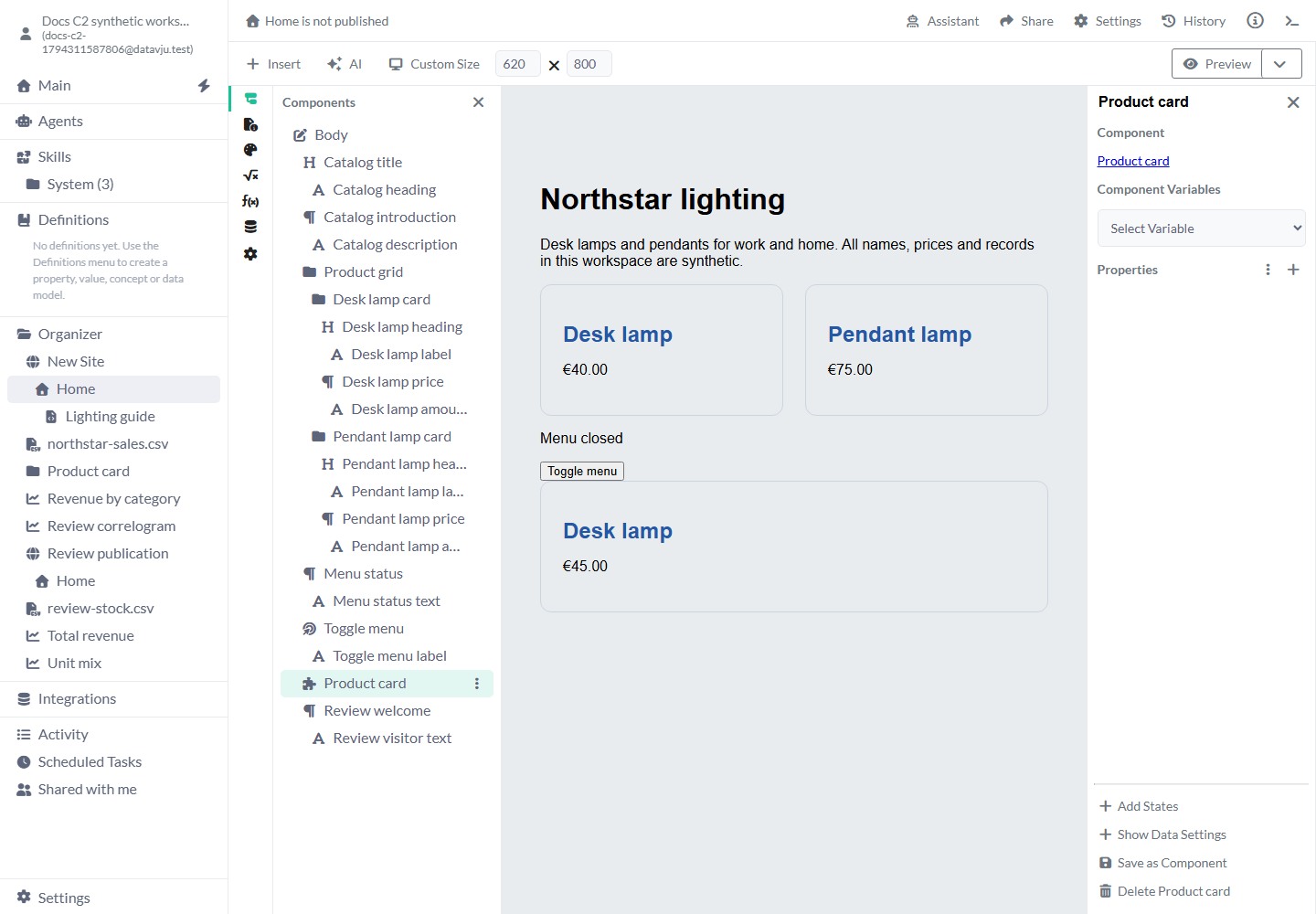
Save Desk lamp / €40.00 as Product card and link it into Home. Change the source amount to €45.00. Home's linked card shows €45.00, while the original card you built on Home still shows €40.00. Save as Component created a reusable copy; choose a link where you want future source changes to appear.
Example: create a campaign variation
Copy Product card from the Component Library into a campaign Page. Change its heading to Summer desk lamp and give it a Background Color of #fff4cc. The source Product card keeps its original heading and appearance. If you only need a different background in one linked placement, add that property to the placement instead.
Limits and common mistakes
A linked Component needs its source and data to remain available wherever you use it.
- Copy the parent that provides the data when children depend on it. Reconnect missing data before saving a reusable design.
- Check every replaced field when changing a placement's Dataset. Identical field labels can still belong to different sources.
- Keep access to the source Component and its nested Components. An unavailable source can prevent its linked copy from loading.
- Preview source changes in the Pages that use them. Publish updated Pages to replace already generated public output.
- Change Variable added through Add Instance Property on a Component linked inside another Component isn't available yet.
Related articles
Story · Page · Styles · States · Interactions