
States
States in Story give an element different properties when conditions match. Use them to show an open-menu label, a stock warning or a message for a portrait screen. You keep one element and choose the values it should show in each situation.
How states work
Every new component has Default State with no conditions. Add a state to override only the properties that need to change, such as Text, Color or Display. Several states can match together; valid values combine in the component's state order, and a later matching value for the same property wins.
An empty condition list matches all the time. When you add several conditions to a state, they must all pass. A component appears while at least one state matches. Keep Default State's condition list empty to show your usual content, then add another state for the change.
Use a Component State for one element. Use a Global State when several elements on the same Page should follow one condition. For hover colors, keyboard-focus outlines and responsive layouts, open the state controls on a CSS Class Style.
Create a variable for an interaction
Create a local variable to hold a temporary value while the Page is open.
A variable holds a temporary value for the Page, such as whether a menu is open. New local variables start as My Variable, with String type and an empty starting value. Data Type also offers Number and Object. Inspect Default Value after changing the type. For an Object, enter valid JSON, such as {"selected": true}. Use a Table when you need to keep a customer's choice after they leave the Page.
- Open Variables in the Story's left toolbar.
- Hover over the Variables root and choose its plus control, then Add Local Variable.
- Expand Variables and select My Variable to open Variable Details.
- Set Name to menuOpen and Data Type to Boolean.
- Set Default Value to False. Choosing Boolean initially sets it to True, so explicitly change it for a menu that should start closed.
- Close Variable Details. Use a Click Event on a Button to change this variable when the visitor acts; see Interactions.
Add a component state
Select the element that should change, then add its condition and changed properties.
- Open Components and select the element to change. For a text change, select its Plain Text node.
- Choose Add States in the properties panel.
- Open the three-dot menu beside States and choose New Component State.
- Open the edit control beside New State and rename it Open menu.
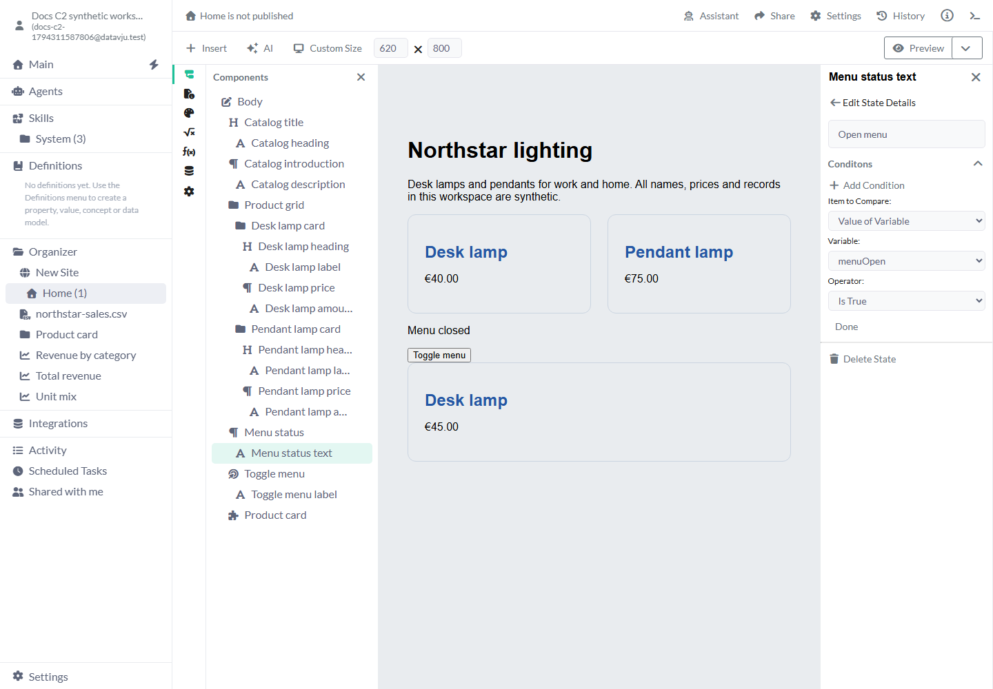
- Choose Add Condition. Set Item to Compare to Value of Variable, Variable to menuOpen and Operator to Is True, then choose Done.
- Return from Edit State Details and select Open menu in the state list.
- Use the plus beside Properties to add Plain Text for that state, then set Text to Menu open. Keep Menu closed in Default State.
- Test the Button in the canvas and Preview. Select a state row when you want to edit its values, then perform the actual action to check what visitors will see.
Share a Global State
Create one shared condition and attach it to each element that should follow it.
Each attached element follows the shared condition and keeps its own Text, Color or other values. Use Remove State to detach one element. Use Delete State when you want to remove the shared condition itself, after checking every element that uses it.
- Select a component with state controls enabled and open its States menu.
- Choose New Global State. The new state is named New State.
- Open the States menu again and enable the toggle beside that global state to attach it to this component.
- Edit the state name and conditions, then add the component's state-specific properties.
- Select another component, open its States menu and attach the same global state. Add the properties that second component should use when the condition matches.
Condition settings
New conditions have no operand, operator or comparison value selected. Complete the condition before expecting it to match. Changing a Dataset operand or nested path clears its old comparison choices so you can select choices appropriate to the new type.
- Item to Compare: Choose Column from Dataset, Media Property or Value of Variable. Content of Element selection is not available yet.
- Column: Choose a field from a Dataset, which is a Table or saved result. The list shows fields available to the selected element from its own data settings or its parents.
- Select Path: Appears for an Object or Array data item. Choose the nested scalar to compare, such as inventory → available. Direct Object, Array and JSON Dataset values offer Is Empty and Is Not Empty.
- Variable: Choose the temporary value that should control this state, such as menuOpen. Each use of a reusable Component can have its own starting value.
- Media Property: Choose a browser property. For orientation, enter portrait or landscape with Equals. For a Boolean property, choose Is True or Is False. Use a responsive Style's Min Width or Max Width controls for width-based CSS changes.
- Operator: Choose an operator supported for the selected value type. The working comparisons are detailed below. Is True, Is False and empty checks need no additional literal.
- Compare Value By: For a comparison requiring a value, choose value and enter the literal. Comparing with another variable through this selector is not available yet.
- Property Name Source: For an Object variable's Property Is True or Property Is False, choose Manual Entry and Property Name, or Column from Dataset and Column. Use a property such as selected to inspect that Boolean entry in the Object.
- Done: Finishes editing this condition. Use the pen to edit it again or the cross to remove a Component State condition. Removing an individual Global State condition is not available yet. Add Condition adds another condition that must also pass.
Working operators
Choose an operator for the type of value you selected. The following comparisons work in States.
Choose one of these comparisons for the state you want to build. Is in and the extra specialized Dataset comparisons are not available in States yet.
- Equals / Does Not Equal: Compare a literal of the right type. String status Equals Available is different from a number or Boolean with a similar written value.
>/</>=/<=: Compare scalar values with a literal. Use a Number quantity > 0 for an in-stock label. Date and date-time fields show the corresponding Before/After labels; supply a comparable typed value and inspect the actual result.- Contains / Does Not Contain: Test whether a String includes the literal text. Case is significant; Lamp and lamp are different.
- Starts With / Does Not Start With / Ends With / Does Not End With: Test a String's beginning or ending, such as a product code starting with LAMP-.
- Is True / Is False: Use these with a Boolean variable or field. Choose Boolean when creating that variable instead of storing the word true as text.
- Is Empty / Is Not Empty: Check an empty text value, null, or an empty Object/Array. Zero and False both count as values. Make sure the selected field has loaded before interpreting an empty result.
- Property Is True / Property Is False: Inspect a Boolean entry of an Object variable using the selected property name. Property Is False also matches when that entry is absent or not true. Direct Object Dataset columns still use only the empty checks; select a nested scalar for a Boolean comparison.
Edit and remove states
Select a state row to edit its properties. Use its pen control to change the name and conditions. Return to Default State whenever you want to change the element's usual appearance or content.
Use Delete State to remove a selected component state. Remove States closes the state-editing controls. For a Global State, use Remove State when only the selected element should stop following it. Check the result whenever several states can match together.
Examples
These examples read a temporary variable, a product quantity or the viewport orientation.
Example: a menu status
With menuOpen False, the text is Menu closed. Give Open menu the condition Value of Variable → menuOpen → Is True and Text Menu open. Configure the Toggle menu Button's Click Event as Change Variable → menuOpen → Apply Function to Value → Switch. One click shows Menu open; a second click shows Menu closed.
Example: a stock warning
A repeated product card reads name and quantity from its Dataset. Desk lamp has quantity 12; Pendant lamp has quantity 0. Give a label Default State text Available, then add an Out of stock state using Column from Dataset → quantity → Equals → value → 0 and Text Out of stock. Only Pendant lamp receives that text. The condition reads each card's row and leaves both quantities unchanged.
Example: a portrait hint
Use an unconditional Default State for a short instruction. Add a Portrait hint state with Media Property → orientation → Equals → value → portrait and a longer Text value. The same component changes its wording with the viewport orientation. Use a responsive Style instead when only font size or spacing should change.
Limits and common mistakes
Finish each condition before testing it. Leaving the entire condition list empty makes a state apply all the time, so add the intended condition before entering an override. If the result surprises you, check the chosen field or variable, its current value and the comparison.
Finish with Done and return from Edit State Details before selecting another element. Changing elements while that editor is open can leave Properties blank; reopen the Page if it happens.
Attach a Global State to each element that should use it. Keep menu choices and similar temporary values in variables, and save customer requests or decisions to a Table.
Choose who can read a Dataset in its access settings, even when a state hides an element. Reopen the Page to check your saved configuration. Publish again when you want visitors to receive the updated conditions or values.
Related articles
Use Interactions to change a variable and Styles or Responsive to change appearance.
- Interactions: Change a variable or invoke a component action from an event.
- Styles: Add Hover, Focus visible and other CSS presentation states.
- Responsive: Configure width and height queries on CSS Class Styles.
- Story: Build the component tree and bind its properties.
- Page: Set the Page's data, route and output.