
Responsive
Responsive design changes a Page's layout and presentation to fit the visitor's viewport. In Datavju, you keep one component tree and add responsive states to CSS Class Styles. Use them when a product grid, navigation, heading or form needs different spacing or layout on a phone, tablet or larger screen.
How responsive Styles work
Put your usual layout in Default State. Add a media state for the settings that should change at a particular width or height. Your text and connected Table rows stay together in the same Page at every size.
Use a named Design System breakpoint when the whole Site should share a width decision. Use a local Media state when the Page has no selected Design System. A regular component's conditional States can also react to Media Property values, such as orientation, when content or attributes should change rather than only CSS.
Create a responsive layout
Put the normal layout in Default State, then add a size condition for the values that should change.
- Select Styles in the Page's left toolbar. Open the Styles root menu and choose Add Style.
- Name the Style Responsive grid and set Style Type to CSS Class.
- In Default State, add Display with grid, Grid Template Columns with repeat(2, minmax(0, 1fr)), and Gap with 24px.
- Choose Add States and open the three-dot menu beside States.
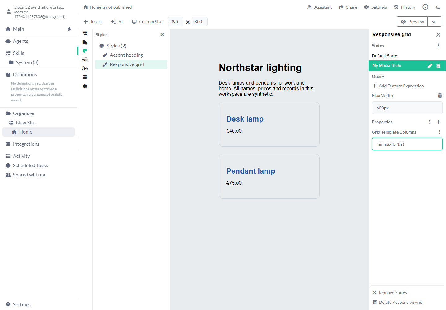
- Without a Design System, choose Media. Select My Media State, then Add Feature Expression and Max Width. Close the Media Features panel and enter 600px in Max Width.
- With that media state selected, add Grid Template Columns with minmax(0, 1fr). Leave values that should stay the same in Default State.
- Select the Product grid element in Components. Use the plus beside Properties, open the Styles category and attach Responsive grid. Remove a direct Grid Template Columns value on the element if it would override the shared CSS Class.
- In the viewport menu choose Custom Size. Set Page width to 620 and then 390. The grid should change from two columns to one; inspect both cards and their text.
Use a named Design System breakpoint
Use a named breakpoint when several Styles should share the same minimum width.
The selector starts at Choose breakpoint. Select one to enable Add breakpoint state. When you choose a Design System, this menu uses its shared breakpoints. Edit the width in Definitions when every element using that breakpoint should follow the change, then publish the affected Pages again.
- Agree the breakpoint in the Design System in Definitions, including its minimum width.
- Select that Design System in the Site's General settings. Reusable Components choose their own Component Design System in Component settings.
- Open a CSS Class Style, choose Add States if needed, and open the States menu.
- Select the breakpoint in Style named breakpoint, then choose Add breakpoint state.
- Select the new state and add the declarations for that minimum width. The Query area identifies its named context; edit the breakpoint's width in Definitions.
- Check below, at and above that width. Republish the affected output after accepting the source changes.
Local media query settings
A new Media state is named My Media State and has no feature expressions. Rename it to describe its purpose, such as Narrow catalog. The values below have no size condition until you add and configure them. Use CSS units for lengths, such as 600px or 40rem.
Several media states can match together. Consecutive simple minimum-width rules in pixels apply from smaller to larger widths; maximum-width rules apply from larger to smaller, so the more specific matching range comes later. Named minimum-width breakpoints follow the same ordering. Compound queries, mixed query types and other units keep their positions in the order you added them. The normal CSS cascade still applies. Keep one clear base and deliberate overrides rather than overlapping rules that accidentally fight each other.
- Width: Matches a specific viewport width. Use it only for an exact-width requirement; 600px will not also match 601px.
- Min Width: Matches that width and larger widths. Use 800px to introduce a wider layout from that point upward.
- Max Width: Matches that width and smaller widths. Use 600px to stack cards on a narrow viewport.
- Height: Matches an exact viewport height. A range is usually more useful when browser chrome changes the available height.
- Min Height: Matches that height and greater heights. Use 700px when extra vertical space should reveal a roomier layout.
- Max Height: Matches that height and smaller heights. Use 500px to reduce decorative spacing in a short landscape viewport.
- Orientation: Offers Landscape and Portrait. Use it for a layout that depends on the viewport's shape; it does not identify a particular device or require a physical rotation sensor.
- Add Feature Expression: Adds another condition to this query. Conditions in the same media state must all match. Min Width 600px plus Max Width 900px defines an inclusive width range.
- Delete feature / Delete media state: The trash controls remove that expression or the entire selected media state. Remove an obsolete rule rather than leaving an unfinished expression.
Editor viewport settings
The viewport menu starts at Laptop 1280x800. Choose a size to inspect your layout in the editor. Visitors see the Page at their own browser's width and height.
Open Preview to check the experience outside the editor's selection controls. Resize the actual Preview viewport as well. A large canvas may extend beyond the space between the editor panels; that clipping is different from the Page's own overflow.
- Custom Size: Shows Page width and Page height. If you have not entered custom dimensions, they start at 1280 and 800. Enter CSS-pixel dimensions to inspect a particular breakpoint, such as 601 and 600 on opposite sides of a narrow-layout rule.
- iPhone 14 Portrait: 390 × 844. Use it to inspect a narrow, tall layout.
- iPhone 14 Landscape: 844 × 390. Use it to inspect wide but short content and forms.
- iPad Portrait: 768 × 1024. Use it for an intermediate, tall viewport.
- iPad Landscape: 1024 × 768. Use it for an intermediate, wide viewport.
- Laptop 1280x800: 1280 × 800 and the initial preset. Use it for the default desktop composition.
- Desktop 1440x900: 1440 × 900. Use it to inspect wider text measures and grids.
- Desktop 1920x1080: 1920 × 1080. Use it to check maximum widths and excess whitespace on a large display.
Examples
Width rules change the grid and heading size; height and orientation can work together for short screens.
Example: a product grid
The synthetic catalog contains Desk lamp at €40.00 and Pendant lamp at €75.00. Responsive grid has two equal columns in Default State and one column at Max Width 600px. At 620px the cards sit side by side; at 390px Pendant lamp moves below Desk lamp. Both prices and the number of product records remain unchanged.
Example: readable headings
Create a Heading Style with Font Size 24px and Line Height 1.2 in Default State. Add a Min Width 800px media state with Font Size 40px. Attach it to the heading element, not its Plain Text child. The same heading uses the larger size on wide viewports and the smaller size below 800px, without a second copy of its text.
Example: a short landscape viewport
Give a hero section Padding 48px 24px in Default State. Add a media state containing Orientation Landscape and Max Height 500px, then set Padding to 20px 24px in that state. Both conditions must match: a tall desktop keeps the base padding, while a short landscape viewport uses less vertical space. Check that its navigation and button still fit and remain reachable.
Limits and common mistakes
Choose CSS Class when you need a Style's media-state menu. Configure Hover and Focus separately from Media. The current controls offer each of these states separately; check your design at each width and during each interaction you use.
Use units for CSS lengths and inspect the query's actual viewport. A browser zoom level, a device's physical screen resolution and CSS-pixel width are different measurements. Check long text, keyboard focus, navigation, inputs and overflow as well as the initial screenshot.
Set Dataset access separately for any private data, including content you hide on small screens. Use the Datavju editor on a desktop from 1280 × 720 CSS pixels, and check your Page's visitor experience at phone sizes too.
Wait for saves to finish and reopen the Page to check your settings. Publish again to show the updated design on an existing public Page.
Related articles
Use Styles for the CSS Class and Design System for shared named breakpoints.
- Styles: Create and attach the CSS Class that owns responsive declarations.
- Design System: Share tokens and named minimum-width breakpoints.
- States: Change component values when variable, data or media conditions match.
- Story: Build and inspect the component tree.
- Page: Configure Page data, navigation and output.