
Story
Story is the editor you use to build Pages and reusable Components in Datavju. Add elements to a tree, set their content and appearance, then preview how people will use them.
How Story works
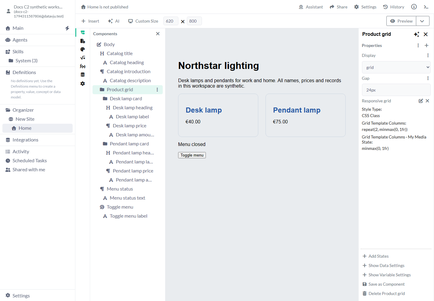
The tree on the left shows the elements in your design. Selecting an element shows its settings on the right; the canvas shows the result. A Page starts with a Body. A reusable Component starts with the element you choose, such as a Div for a product card.
Your structure, properties, text, Styles, States and events save automatically. Dataset settings connect the design to a Table or saved result. Preview runs the draft; Prerender builds a separate HTML preview; Publish makes a version available through the Page or Site.
Build your first layout
Build the structure on a Page before adding shared Styles or data.
- In Organizer, open a Page. For a new Page, open the destination folder's menu and choose Create → Page. To start a reusable piece instead, follow the Component guide.
- Choose Components in the Story toolbar. Select Body in the tree.
- Open Insert and choose Div. Give it a descriptive Name, such as Product grid.
- With that Div selected, insert a Heading (H1 to H6). Insert Plain Text inside it and enter Northstar lighting in Plain Text.
- Select the Div again and insert a Paragraph with its own Plain Text child. Enter a short introduction.
- Select each element and use Add property to add its settings. For example, add Padding to Body and enter 32px.
- Close the explorer to inspect the canvas. Open Preview to check the Page without editor selection outlines.
Find the right panel
Components edits visible content; Head edits the document metadata that readers of the HTML receive.
- Components: select, rename, insert, copy, move or delete the visible elements. Expand a row to see its children. Select the intended parent before inserting.
- Head: edit the browser title, metadata, document links, styles and scripts. Start with Add Head Component when the Page has no Head.
- Styles: create reusable appearance settings and attach them to elements.
- Variables: create temporary values such as menuOpen. Use them in properties, States and events.
- Functions: configure Observe Visibility, Scroll Position or Update at Intervals for behavior that continues while the Page is open.
- Datasets: choose a Page Dataset for record-based Pages and see component data connections.
- Settings: configure the Page's available authentication and publication settings.
Edit properties and values
Select an element to see its existing settings. Use Add property to browse or search for another setting. All shows the usual choices; the Attributes category contains HTML attributes such as Name for a Meta element. Only choices supported by the selected element appear in the normal list.
A new optional CSS property starts empty and uses the browser's normal result until you enter a value. Enter units where CSS needs them: 24px for Padding, 100% for Width or 1.4 for Line Height. Some required properties already have a starting value. Select a Heading's type before choosing its text size; the heading level describes the content's structure.
Text usually lives in a Plain Text child. A Heading supplies the heading element and its formatting; its Plain Text child supplies the words. Select the containing Button or Link when adding a Click Event, then select the Plain Text child to edit its label.
Connect a design to data
Choose the source on a parent element, then select its fields in the elements inside it.
A Dataset is the Table or saved result your design reads. Connecting an element to a Dataset can repeat it for the selected rows; Index Query selects one row. A Page Dataset creates separate record-based Pages. Use the Page guide for those page addresses.
- Select the element that should provide data to the elements inside it.
- Choose Show Data Settings. Use Add Dataset to select the saved source you need.
- Select the child property that should show a field. Choose the data value control and select the Dataset column.
- For a value inside an Object, use Select Path to choose the required part.
- Check more than one record and an empty result. If a child needs a parent's data, keep that parent when copying the whole design.
Render structured article content
Use Parser → JSON to Elements when a Dataset contains a structured article tree. Choose Add Dataset and select that source. Wait for Saving selection… to finish, then inspect the canvas and Preview. Headings become heading elements, pre/code preserves literal code, and images use their supplied source and alternative text.
Choose this for content already stored as structured JSON. For an ordinary hand-built Page, insert its Heading, Paragraph and other elements through Components. Set the content's Dataset access before publication.
Viewport, inspection and save settings
Changing the editor viewport previews a size; responsive Styles control the layout visitors receive.
- The viewport control starts at Laptop 1280x800. Choose a preset or Custom Size to change the editor canvas. It helps you inspect a layout; set responsive behavior in Styles.
- Components selection outlines help you find elements. Check Preview for normal links, focus and controls.
- Preview opens a running draft in another tab. Prerender opens generated HTML. Use both when checking data, metadata or interactions that must also work after publication.
- Wait for saving to finish before closing. If a save reports a conflict, reopen the Page to load the saved version, then reapply the change you still need.
- AI and Assistant help with supported edits and questions about the open design. Review their result on the canvas and in Preview.
Examples
The catalog uses fixed text; the same structure can later display fields from a Dataset.
Example: a catalog introduction
Create Body → Heading → Plain Text with Northstar lighting. Add Body → Paragraph → Plain Text with Desk lamps and pendants for work and home. Give Body Padding 32px and Font Family Arial, sans-serif. The result is a readable heading and introduction with space around them.
Example: a two-card product grid
Create a Div called Product grid and set Display to grid, Grid Template Columns to repeat(2, minmax(0, 1fr)) and Gap to 24px. Insert two card Divs containing a Heading and Paragraph. Enter Desk lamp / €40.00 and Pendant lamp / €75.00. Give each card Padding 24px, Border 1px solid #cbd5e1 and Border Radius 12px. You get two equally sized columns; the Responsive guide shows how to stack them on a phone.
Limits and common mistakes
Selection, CSS values and data context are the first things to inspect when the layout surprises you.
- Select the containing element for layout and events, and its Plain Text child for words. If a setting is missing, check your selection first.
- Use a complete CSS value with units where needed. Check the canvas after changing Display, Width or Overflow.
- Keep the parent that supplies data when saving a self-contained Component. Reconnect any unavailable data before using the result.
- Changes save to your draft. Publish the Page or Site when the reviewed draft should replace its public version.
Related articles
Page · Component · Styles · States · Responsive · Interactions · Page metadata