
Design System
A Design System in Definitions stores shared colors, spacing, font settings and theme choices. Save each reusable value as a token, then select it in a compatible Style property on a Page or Component. Use it when several parts of your app or site should follow the same design choices.
Create a system and its first token
A new system starts as Draft with twelve token categories. Tokens are named design values: for example, Brand blue can hold a Color and Card padding a Dimension.
Select the system, category, group or token in the tree to open its own editor. Discard changes restores the saved version; Cancel closes a new unsaved entry.
- Hover Definitions and open Definitions actions.
- Choose New design system.
- Enter Design system name, such as
Guide design, and choose Create design system. - Open Colors under Tokens and choose Add token.
- Enter Token name, such as
Brand blue. Value type starts at the category's suggested type, Color. - Set its color with Colour picker or Derived Hex, for example
#2457A6. - Choose Create token. Use Save token for later changes.
Organize tokens
Each starting category suggests a type for new tokens. Choose the category that helps other builders find the value.
Choose Add category for another area or Add group for a nested collection. Groups can hold tokens and further groups. In their Settings, Suggested type for new tokens starts with the saved suggestion or No suggestion. Changing it affects new tokens and keeps existing values in place.
- Colors - Starting type: Color. Example: Brand blue or body text.
- Font Families - Starting type: Font family. Example: A first-choice font and its fallbacks.
- Font Weights - Starting type: Font weight. Example: Normal or bold text.
- Typography - Starting type: Typography. Example: Font family, size, weight and line spacing together.
- Spacing - Starting type: Dimension. Example: A 16px content gap.
- Sizing - Starting type: Dimension. Example: A control's height.
- Border Radius - Starting type: Dimension. Example: A 4px corner radius.
- Borders - Starting type: Border. Example: Width, stroke and color together.
- Shadows - Starting type: Shadow. Example: A card's shadow.
- Gradients - Starting type: Gradient. Example: Color stops for a transition.
- Opacity - Starting type: Number. Example: An opacity value.
- Motion - Starting type: Duration. Example: A transition duration.
Choose a value type
Use Value type when creating a token, or the corresponding setting under Settings later. The type determines the fields you edit. A Dimension includes a unit; a Number does not.
For a Fluid dimension, use matching units for the two sizes and matching units for the two viewport widths. Maximum size must be at least Minimum size, and Maximum viewport must be greater than Minimum viewport.
Named font weights group familiar names at the same numeric value: Thin/Hairline 100, Extra light/Ultra light 200, Light 300, Normal/Regular/Book 400, Medium 500, Semi bold/Demi bold 600, Bold 700, Extra bold/Ultra bold 800, Black/Heavy 900, Extra black/Ultra black 950.
- Color - Starting value: Black in sRGB, opacity 100%. Set a color such as
#2457A6; use the color controls below for advanced values. - Dimension - Starting value: 0px. Enter Amount and Unit, px or rem. Use 16px for a fixed card inset or 1rem to follow the page's root font size.
- Fluid dimension - Starting value: 16px at a 320px viewport, growing to 32px at 1280px. Set Minimum size, Minimum viewport, Maximum size and Maximum viewport, each with Amount and Unit. Use 18px at 390px and 24px at 1440px for text that grows with the viewport.
- Font family - Starting value:
sans-serif. Enter the first choice, then Add fallback family. Move entries up/down to change their order or Remove an extra entry. Use a supplied font first andsans-serifas fallback. - Font weight - Starting value: Numeric weight 400. Weight representation chooses Numeric weight or Named weight. Enter 1–1000 numerically, for example 700 for bold, or choose a named weight.
- Duration - Starting value: 0ms. Set Amount and Unit, ms or s. Use 200ms for a short transition.
- Cubic Bézier - Starting value: Start X 0.2, Start Y 0, End X 0.2, End Y 1. Edit the four curve coordinates to change easing. Start X and End X use 0–1;
0, 0, 1, 1gives a linear curve. - Number - Starting value: 0. Enter a unitless number, such as 0.8 for opacity.
- Typography - Starting value:
sans-serif, size 16px, weight 400, line height 1.5, letter spacing 0px. Edit Font family, Size, Weight, Line height and Letter spacing together. Advanced typography → Size representation switches between Fixed dimension and Fluid dimension, replacing the size with that type's starting value. - Shadow - Starting value: One black layer with zero offsets, blur and spread; Inset off. Set Colour, X offset, Y offset, Blur, Spread and Inset. Add, remove or reorder layers. For example, a small positive Y offset and blur give a raised-card treatment.
- Border - Starting value: Black, Width 1px, Stroke Solid. Edit Width, Stroke and Colour. Use a 1px solid gray border for a card outline.
- Transition - Starting value: Duration 200ms, Delay 0ms, easing
0.2, 0, 0.2, 1. Change Duration, Delay and Easing. Use a zero delay for an immediate hover transition. - Gradient - Starting value: Two black stops at Position 0 and 1. Set each stop's Colour and Position, from 0 to 1; add, remove or reorder stops. Use two different colors at 0 and 1 for a simple gradient.
- Stroke style - Starting value: Solid. Choose Solid, Dashed, Dotted, Double, Groove, Ridge, Outset, Inset or Custom dash pattern. Custom starts with 4px and 2px dashes and a Butt line cap; change the dash lengths/order and choose Round, Butt or Square caps.
Color controls
Use Colour picker or Derived Hex for a usual RGB color. Opacity is a percentage and starts at 100. For example, 50 makes it half transparent.
Open Advanced colour to choose Colour space: sRGB, Linear sRGB, Display P3, Adobe RGB (1998), ProPhoto RGB, Rec. 2020, XYZ (D65), XYZ (D50), HSL, HWB, Lab, LCH, OKLab or OKLCH. Keep sRGB for ordinary web colors; choose another space when matching a value supplied in that space. Changing Colour space keeps the channel numbers and interprets them in the new space; it does not convert the current color. Edit its named channel fields using numbers or none for an unspecified channel. Their allowed ranges depend on the space. Fallback hex (optional) starts empty; add a six-digit RGB fallback when needed, or choose Remove fallback hex to clear it.
Reuse another token's value
Choose Use reference, find a compatible token or value property, then select it. A reference makes this value follow another token. For example, a Text primary Color can follow an Ink Color; changing Ink updates the values that follow it.
When a reference resolves, Use literal… → Use current resolved value keeps a fixed copy of its result. When it cannot resolve, Use literal… → Enter a new literal starts a separately edited value. Advanced value settings → Individual value property lets you reference one part of a larger value, such as a border's color. Review Result after changing a reference.
Preview values
The Result preview shows the value for the selected theme modes. Sample viewport width starts at 768 and Preview rem basis at 16px; change them to illustrate dimensions or typography at another size. The font-weight specimen's Temporary sample family starts at system-ui and offers serif, sans-serif and monospace. These preview choices leave the saved token value in place.
Add light and dark modes
A theme dimension groups choices, such as Appearance with Light and Dark modes. Each dimension has one saved default, used when a Page has no explicit choice.
Value context lists Base value and saved overrides as separate editing targets. Preview modes changes only the temporary preview; it keeps the editing target selected. Use system defaults clears the preview's explicit choices. Change conditions edits an override's modes; remove an override when that context should inherit the base value again. Start from result instead, under Other starting value, copies the current result as a fixed value instead of continuing to follow its references.
More specific matching overrides win: an Appearance-and-Brand override wins over one for Appearance alone. Settings → Resolution priority settles equally specific overlaps. The first dimension starts at 0; each new dimension gets the next higher number, and higher numbers win. Keep priorities distinct.
- Open the system and choose Add theme dimension.
- Set Theme dimension name to
Appearance, then Create theme dimension. It starts with one mode named Default. - Open Default, rename Theme mode name to
Light, and choose Save theme mode. - Open Appearance, choose Add mode, name it
Dark, and choose Create theme mode. Default mode stays Light unless you change and save the dimension. - Open a token and choose Value context → Another context. Set Appearance to Dark and choose Use context.
- For an inherited value, choose Add override for these conditions, edit the value and Save token.
Names, settings and saving
Save changes on the selected object. Save design system, Save token, Save theme dimension and Save theme mode apply to their respective editors. A refused save keeps your draft and explains the problem. Reload saved definition loads another editor's saved revision when there is a conflict.
Used by shows where a value is used. Open the object's actions menu for Duplicate or Delete. A duplicate is a separate copy; references within a copied collection follow its copied tokens, while references to other collections keep their existing sources. Delete previews the affected items. To replace a deprecated token, save a same-type replacement first, then review the proposed changes before confirming deletion.
- Name - Starting state: The label you entered. Give the system or token a readable name. Renaming a token keeps its existing Style connections.
- Key, under Settings - Starting state: Generated from the name for a new entry. A unique short identifier among siblings, such as
card-padding. Use letters, numbers, hyphens or underscores and begin with a letter or number. - Description - Starting state: Empty. Explain the design choice, for example a gap used between card contents.
- System Status - Starting state: Draft. Keep incomplete work in Draft. Ready to use checks the tokens across the configured theme contexts. Deprecated marks a system being retired.
- Token Value type - Starting state: Its category/group suggestion. Choose the value's real type. Changing an existing token's type keeps its old value until you correct any mismatch.
- Tier - Starting state: Not specified. Primitive for a base value, Semantic for meaning such as Text primary, or Component for a specific part such as Button background.
- Use, Avoid - Starting state: Empty. Describe where a token should and should not be used.
- Deprecated - Starting state: Off. Mark an old token; add a Deprecation reason and a same-type Replacement token when retiring it.
- Metadata - Starting state: Empty. Add an owner, source or tags with New metadata key, Type and Add metadata. String starts empty, Number at 0, Boolean at false, Object as
{}and Array as[]. Edit Object/Array values as valid JSON; Remove deletes that entry.
Add font files
A font-family token names the typeface and fallbacks. Upload and declare its font file when the site needs to deliver that typeface.
Format starts at WOFF2 and also offers WOFF, TrueType and OpenType; match the uploaded file. Weight or range starts at 100 900; use the actual file's weight or supported variable range, such as 400 or 100 900. Style starts at Normal, with Italic and Oblique available. Loading behavior starts at Swap, which shows a fallback font while the file loads and swaps in the downloaded font. Automatic lets the browser decide. Block briefly hides text while waiting, then permits a swap. Fallback permits only a short late swap. Optional keeps the fallback once text has been painted.
Use Edit declaration or Remove declaration to change the list, then save the system. Cancel declaration discards that draft; a file already uploaded stays in workspace uploads.
- Open the system's Font files and choose Add font file.
- Choose Font family token, select the font file and choose Upload workspace font.
- Review Format, Weight or range, Style and Loading behavior.
- Choose Apply declaration, then Save design system.
Define a reusable Component
Under the system's Components, choose Add Component to describe the purpose and design requirements of a reusable interface part. This definition helps you check an Organizer Component against those requirements.
Purpose, Use and Avoid start empty. Requirements, Capabilities, Accessibility and Token roles start empty too. Write Requirements as the behavior the Component should provide and Accessibility as expectations for people using keyboards or assistive technology. Capabilities lists the Style properties an implementation should support. Parts starts with Root, Variants with Default and States with Default. Add the parts and choices you need, such as a label part, a compact variant or Hover state. The state choices include Default, Hover, Focus visible, Active, Disabled, Invalid and Selected.
Choose Add token role, then Part and Role, to say which Style value a part needs, such as Root background. In the reusable Organizer Component's settings, choose its own Design System and use Implements to select this definition. You can also use Link implementation from the definition, choose an Organizer Component and Link it. Inspect its implementation checks and Preview, including Variant and State choices; Unlink removes the connection. Check rendered behavior and accessibility separately from these structural checks.
Apply tokens to a Page or Component
A Style property uses the token you select, such as Card padding for Padding. The Site chooses the system used by its Pages; a reusable Component chooses its own system.
- In a Site, choose General → Design System and select your system.
- For a reusable Component, select its Design System in its own settings.
- Open the relevant Style property, choose Choose token and select a compatible token by its category/name.
- Select the element that should use this Style. Choose the plus beside Properties, open the palette category, then select the Style by name. See Styles for creating and attaching Styles.
- Use a Page or Component's Theme context to select modes. Use default modes clears explicit mode choices.
- Inspect Preview. Publish again when you want published Pages to receive your new design values.
Examples
The sample system uses Brand blue #2457A6, Card padding 16px, and Light/Dark Appearance modes. Keep the same token choices in Styles while changing their saved values.
Give a card its brand color
Use one saved Color instead of entering the same hex value on each Style.
- Create Colors → Brand blue with Derived Hex
#2457A6and save it. - Select Guide design in your Component's settings.
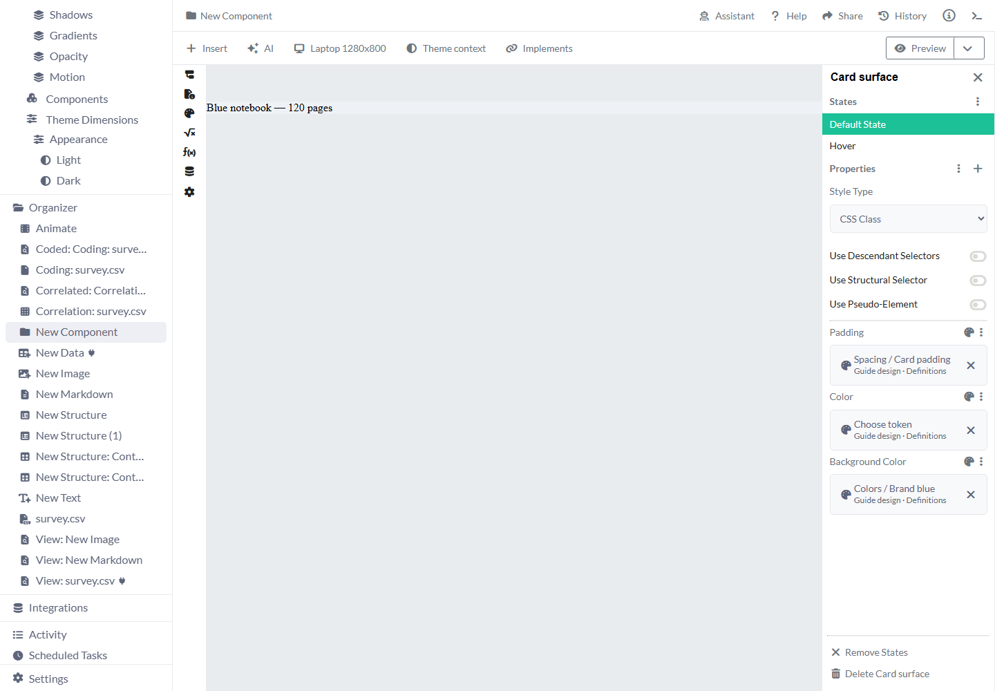
- In its Style's Background Color, choose Choose token → Colors / Brand blue.
- Select the card element in Components. Choose the plus beside Properties, open the palette category and select the Style by name.
- If the element already has its own Background Color, remove that property through Background Color settings → Delete so the shared Style can supply it.
- Preview the Component in its default mode. Reuse this token on other compatible Style properties that should follow the same brand color.
Share a card inset
Keep a unit with the spacing value so it can be used by Padding.
- Open Spacing, choose Add token and name it
Card padding. - Keep Value type Dimension and set Amount 16, Unit px, then create the token.
- In the card Style's Padding, choose Choose token → Spacing / Card padding.
- Attach that Style to the card element as in the previous example. Preview the inset and text wrapping. Later, save 24px on the same token to change the shared spacing.

Use a lighter brand color in Dark mode
Give Brand blue one contextual value while keeping its existing Style connections.
- Create Appearance with Light as the saved default and add Dark.
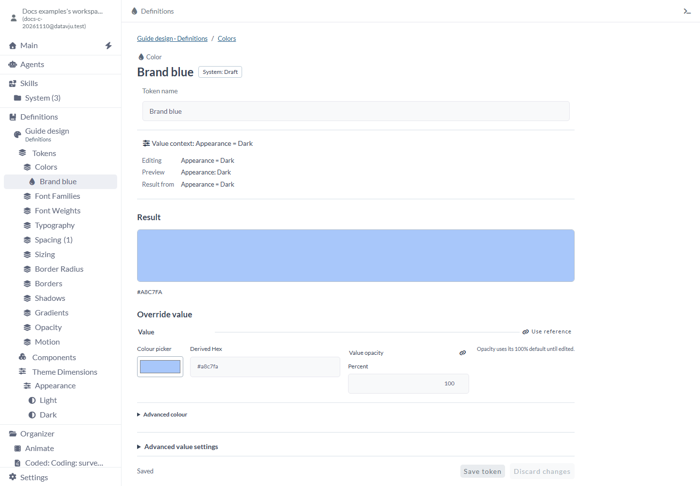
- On Brand blue, choose Value context → Another context, select Appearance Dark and Use context.
- Choose Add override for these conditions, enter Derived Hex
#A8C7FAand Save token. - Check that Editing and Preview both name Appearance Dark and Result shows
#A8C7FA. - Preview Light to check the base result
#2457A6. The saved Dark override stays in place.
Limits and common mistakes
- Check Editing and Preview before changing a contextual value; they can show different modes.
- Use a Dimension for spacing and a Number for unitless values. A Number containing 16 cannot replace a 16px spacing token.
- Repair invalid values or references before selecting them in a Style. Ready to use checks every configured context.
- Reordering array entries, such as gradient stops or shadow layers, changes their indexed properties. Check references to individual entries after reordering.
- A font-family name needs its declared uploaded file when visitors must use that font.
- Publish again to update a published Page's compiled design values. Use Models when copying the built items and required Definitions to another workspace.
Related articles
- Definitions - organize shared meaning and design choices.
- Styles - apply tokens to elements.
- Responsive - use viewport choices and fluid values.
- Component - build a reusable interface part.
- Models - copy built items and their required Definitions.