
Styles
Styles save an appearance that you can apply to several elements in a Page or Component. Use a shared Style for repeated headings, cards, buttons or layouts, so one edit updates their appearance together.
How Styles work
A Style holds settings such as Color, Padding and Display. Attach it to the elements that should use those settings, then edit the Style to change them together. Add a property directly to an element when only that element needs the change.
A Design System in Definitions gives names to shared design choices, such as a brand color or spacing size; these named choices are called tokens. Choose them in a Style when you want to reuse those decisions. Changes save automatically. Wait for Saving changes… to clear; if Changes not saved. appears, correct the error and choose Retry.
Create and attach a Style
Create one Style, then attach it to every element that should share its appearance.
- Open your Page or Component and select Styles in the left toolbar.
- Hover over the Styles root, open its three-dot menu and choose Add Style.
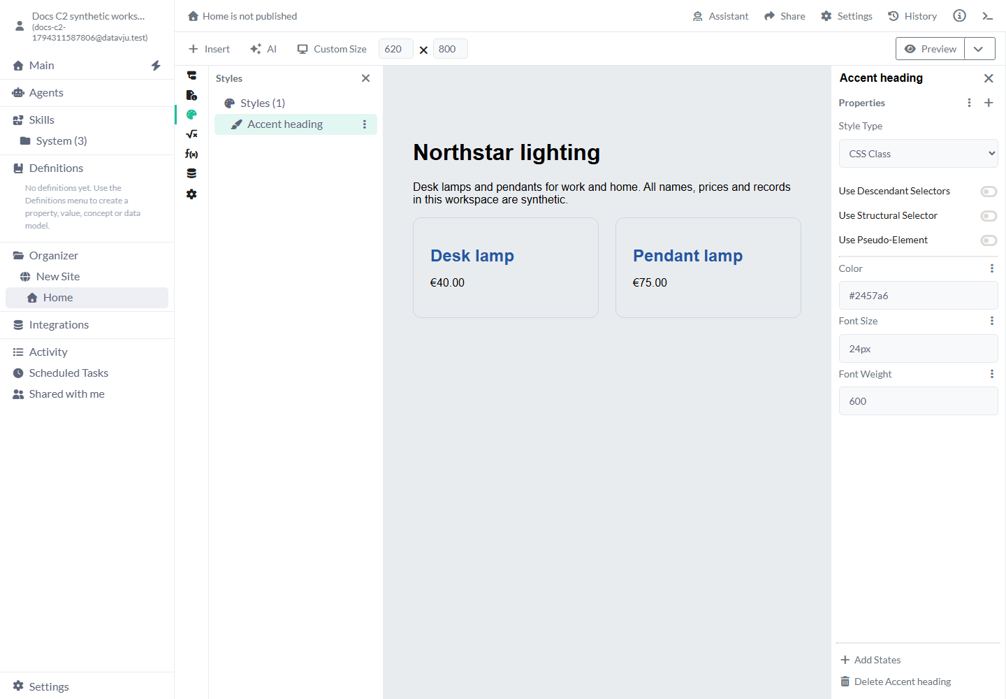
- Select My Style and enter a descriptive name, such as Accent heading, in the properties-panel title.
- Set Style Type to CSS Class. New Styles start at Select Style Type; choose a type before expecting an effect.
- Use the plus beside Properties to add Color, Font Size and Font Weight. Enter #2457a6, 24px and 600.
- Open Components and select a heading element. Use the plus beside Properties, select the Styles category and choose Accent heading.
- Attach the same Style to a second heading. Both headings now use the same color, size and weight. Reopen Styles to change the shared definition.
Choose the Style Type and target
Changing Style Type removes selector settings belonging to the previous type. Attach the Style by selecting its readable name in the property explorer.
- Style Type — CSS Class: Produces shared CSS applied through a class. Choose this for hover, keyboard-focus, responsive rules or selectors. No type is selected when a Style is created.
- Style Type — Inline Style: Applies declarations directly to each attached element. Choose it for a simple reusable set of inline values. The CSS state and selector controls belong to CSS Class Styles.
- Use Descendant Selectors: Off initially. Turn it on and enter Selectors such as p to style paragraphs inside each attached element. Leave it off to style the attached element itself.
- Use Structural Selector: Off initially. Turn it on to add a Structural Selector such as :first-child when only an element in that structural position should match. Inspect the rendered selector and matching elements.
- Use Pseudo-Element: Off initially. Turn it on to target a Pseudo-Element such as ::before. Add Content (style) if the pseudo-element should generate text or an empty decorative box.
Enter values and reuse Design System tokens
Add only the properties you need. Unless a starting value is listed below, a new property starts empty and your element keeps the styles supplied by the browser, its parent and other applied rules. Remove the property when you want those rules to determine the value again.
Dropdown controls offer the named CSS values listed in the reference below and Custom Value for another valid CSS value. Text fields accept normal CSS syntax, including units: use 24px for a size, 1.5 for a line-height ratio, or repeat(2, minmax(0, 1fr)) for grid columns. A value the browser cannot interpret has no CSS effect.
Use the palette control beside a supported property to choose a token from your Design System. A color property offers color tokens; a size property offers dimension tokens. The property follows that named choice when it changes. Use its remove control before entering a fixed value instead. Choose Show Data Settings or Show Variable Settings when a supported property should use a Table field or a temporary Page value.
Add interaction and responsive states
Use CSS Class states to change appearance during an interaction or at a viewport size.
- Select a CSS Class Style and choose Add States.
- Open the three-dot menu beside States and enable the state you need.
- Select that state in the list and add its declarations. Default State remains the base.
- Test the real action in Preview. Selecting a state for editing does not mean the visitor is hovering or focusing the element.
- With a selected Design System, choose Style named breakpoint and Add breakpoint state for a responsive override. Without one, choose Media and configure its Query. See Responsive for the complete workflow.
Interaction states
Choose a state for the interaction or viewport condition you want to style.
- Hover: Applies while a pointing device hovers the element. Use a background change on a button; keep an equivalent keyboard focus indication.
- Active: Applies during activation, such as pressing a pointer button. It does not mean the current navigation Page.
- Focus: Applies while the element has focus. Use it for an input border or outline.
- Focus visible: Applies when the browser considers a visible focus indication necessary, including keyboard navigation. Use an Outline rather than removing focus feedback.
- Disabled: Matches disabled controls. Styling a button does not itself disable it; set the control's actual Disabled property too.
- Invalid: Matches an element marked aria-invalid="true". Use it with the control's validation feedback; merely adding the Style does not perform validation.
- Selected: Matches selected widgets using their selection attributes. It is separate from a current Page link.
- Current page: Styles Links whose destination is the exact current Page. Query strings, fragments and trailing slashes do not change that match; parent paths are not automatically current.
Reuse, copy and remove Styles
Attach an existing Style by name from the property explorer's Styles category. To remove an attachment, remove that Style property from the selected element; the source Style remains available to its other elements.
Use Copy and Paste in the Styles tree when you want an independent definition. Use a Style Library link when the destination should continue using a Style you can access. A copy's later edits are independent; a link still requires access to its source. Reusable Components can carry their own Styles and Design System.
Examples
Share one appearance across headings, add focus feedback to buttons, or target paragraphs within a card.
Example: two product headings
Start with Desk lamp and Pendant lamp headings using the browser's ordinary heading appearance. Create Accent heading with Color #2457a6, Font Size 24px and Font Weight 600, then attach it to both headings. Both become blue 24-pixel headings; changing the shared Color changes both without editing their text, prices or product rows.
Example: a keyboard-accessible button
Create a CSS Class Style named Primary button. Add Background Color #2457a6, Color white and Padding 12px 20px in Default State. Attach it to a Button, enable Hover and set a darker Background Color. Enable Focus visible and add Outline 3px solid #ffbf47 and Outline Offset 3px. In Preview, hover, move the pointer away, then reach the button with Tab: the hover color clears and the keyboard outline remains visible while focused.
Example: paragraphs inside a card
Create Card copy as a CSS Class, enable Use Descendant Selectors and set Selectors to p. Add Color #475569 and Line Height 1.5, then attach the Style to the card's Div. Its paragraphs receive that presentation; the card's heading and its stored content remain unchanged. Without the descendant selector, the declarations target the card itself and ordinary CSS inheritance decides what its children receive.
CSS property reference
New optional CSS settings start empty. Add a value when the element needs an override; the browser otherwise uses its normal CSS result. Translate starts at 0px, and CSS Variables starts with an empty list.
Layout and sizing
Choose a property for the change you need. New optional values start empty; the browser keeps the other rules already applied to your element.
- Aspect Ratio: Keep a width-to-height proportion, for example 16 / 9 for a media card.
- Box Sizing: Choose how width and height include padding and borders. Border Box keeps a padded card within its stated width. Choices: Content Box (default), Border Box.
- Display: Choose the layout: grid for tracks, flex for a row or column of items, or none to hide the element and its layout space. Choices: block, flex, grid, inline-flex, flow-root, inline, inline-block, none.
- Position: Choose the positioning scheme. Relative keeps normal flow; Absolute positions inside an ancestor; Fixed follows the viewport; Sticky sticks while scrolling. Choices: Static (default), Relative, Absolute, Fixed, Sticky.
- Inset: Set top, right, bottom and left together, for example 0 to fill a positioned parent.
- Top: Position an element from its containing box’s top edge, for example 16px.
- Right: Position an element from the right edge of its containing box, for example 16px.
- Bottom: Position an element from the bottom of its containing box, for example 16px with Absolute positioning.
- Left: Position an element from its containing box’s left edge, for example 16px.
- Width (style): Set an element’s width, for example 100% inside a card.
- Height (style): Set an element’s height, for example 240px for an image box.
- Min Width: Keep an element at least this wide. Use 0 when a flex/grid child should shrink below its text’s natural width.
- Max Width: Limit an element’s width, for example 72rem for a page’s content.
- Min Height: Keep an element at least this tall, for example 320px for a hero.
- Max Height: Limit an element’s height, for example 400px for a scrollable list.
- Float: Float an element to the left or right when text should flow beside it. Choices: Left, Right.
- Object Fit: Fit an image or video inside its box. Cover fills the box with cropping; Contain keeps the whole image visible. Choices: Contain, Cover, Fill, None, Scale Down.
- Object Position: Choose which part of fitted media stays centered, for example center top for a portrait.
- Overflow: Choose how content exceeding either axis is shown. Auto allows scrolling when needed. Choices: Visible (default), Hidden, Clip, Scroll, Auto.
- Overflow X: Control horizontal overflow, for example auto for a wide table.
- Overflow Y: Control vertical overflow, for example auto on a height-limited list. Choices: Visible (default), Hidden, Clip, Scroll, Auto.
- Resize: Allow user resizing where the element and overflow settings support it, for example vertical on a text area.
- Scroll Behavior: Choose scrolling behavior, for example smooth for anchor navigation.
- Scroll Padding Top: Reserve space above a scrolled-to target, for example 72px beneath a sticky header.
- Z-Index: Set stacking order in a supported stacking context, for example 10 on a positioned dropdown.
Spacing
Choose a property for the change you need. New optional values start empty; the browser keeps the other rules already applied to your element.
- Margin: Set space outside an element, for example 0 auto to center a width-limited block.
- Margin Top: Set outside space above an element, for example 32px before a section.
- Margin Right: Set outside space on the right, for example 12px beside a label.
- Margin Bottom: Set outside space below an element, for example 24px after a paragraph.
- Margin Left: Set outside space on the left, for example 12px beside an icon.
- Padding: Set space inside all borders, for example 24px for a card or 12px 20px for a button.
- Padding Top: Set inside space at the top, for example 24px.
- Padding Right: Set inside space on the right, for example 24px.
- Padding Bottom: Set inside space at the bottom, for example 24px.
- Padding Left: Set inside space on the left, for example 24px.
- Gap: Set row and column spacing together, for example 24px in a card grid.
- Row Gap: Set space between rows in flex/grid layouts, for example 16px.
- Column Gap: Set space between columns in a flex or grid layout, for example 24px.
Flex and grid layout
Choose a property for the change you need. New optional values start empty; the browser keeps the other rules already applied to your element.
- Flex: Set grow, shrink and basis together, for example 1 1 240px on flexible cards.
- Flex Basis: Set an item’s starting main-axis size, for example 240px before it grows or shrinks.
- Flex Direction: Choose the main direction of a flex container. Column stacks form fields vertically. Choices: Row (default), Row Reverse, Column, Column Reverse.
- Flex Grow: Choose how an item takes spare space, for example 1 for an expanding search field.
- Flex Shrink: Choose how an item shrinks when space is short, for example 0 to keep an icon’s width.
- Flex Wrap: Allow flex items onto another line. Wrap helps a row of cards fit a narrow viewport. Choices: No Wrap (default), Wrap, Wrap Reverse.
- Align Content: Distribute lines or tracks when a container has extra space, for example space-between.
- Align Items: Align items across a flex or grid container; Center vertically aligns a row of controls. Choices: Normal (default), Center, Start, End, Flex Start, Flex End.
- Align Self: Override one item’s cross-axis alignment; Center can align an icon beside taller text. Choices: Normal (default), Center, Start, End, Self Start, Self End, Flex Start, Flex End.
- Justify Content: Distribute items along the main axis. Space Between separates the first and last items to opposite edges. Choices: Normal (default), Start, Center, End, Flex Start, Flex End, Space Between, Space Around, Space Evenly.
- Place Content: Set align-content and justify-content together, for example center in a grid.
- Order: Change a flex/grid item’s visual order, for example 1 to place it after items with the usual zero order.
- Grid: Set the complete grid shorthand when you need to define tracks and auto-placement together.
- Grid Area: Place an item in a named area such as hero, or give row/column boundaries such as 1 / 1 / 2 / 3.
- Grid Auto Columns: Set sizes for implicitly created columns, for example minmax(160px, 1fr).
- Grid Auto Flow: Choose how automatically placed items fill the grid. Row fills rows; Column fills columns; Dense attempts to fill gaps. Choices: Row (default), Column, Dense, Row Dense, Column Dense.
- Grid Auto Rows: Set sizes for implicitly created rows, for example minmax(120px, auto).
- Grid Column: Place an item across columns, for example 1 / 3 to span the first two tracks.
- Grid Column Start: Choose the starting column line, for example 1.
- Grid Column End: Choose the ending column line, for example 3.
- Grid Row: Place an item across rows, for example 1 / 3.
- Grid Row Start: Choose the starting row line, for example 1.
- Grid Row End: Choose the ending row line, for example 3.
- Grid Template: Set explicit grid rows, columns and areas together when you need the CSS shorthand.
- Grid Template Areas: Name your grid areas, for example "hero hero" "nav content".
- Grid Template Columns: Set column tracks, for example repeat(2, minmax(0, 1fr)) for two equal columns.
- Grid Template Rows: Set explicit row tracks, for example auto 1fr auto for header, content and footer.
Text and lists
Choose a property for the change you need. New optional values start empty; the browser keeps the other rules already applied to your element.
- Font: Set the font shorthand, for example 600 24px/1.2 Arial, sans-serif.
- Font Family: Choose the font list, for example Arial, sans-serif.
- Font Size: Set text size with a unit, for example 24px for a card heading.
- Font Style: Set a font style, for example italic for a quotation.
- Font Weight: Set text weight, for example 600 for a heading.
- Letter Spacing: Adjust spacing between letters, for example 0.04em on a short label.
- Line Height: Set line spacing, for example 1.5 for body text.
- Text Align: Align inline content, for example Center for a short card heading. Choices: Start, End, Left, Right, Center, Justify, Justify-all, Match-parent.
- Text Decoration: Set text-decoration shorthand, for example underline solid for links.
- Text Decoration Color: Set decoration color separately, for example #2457a6 for an underline.
- Text Decoration Line: Choose which decoration line to draw, for example underline.
- Text Transform: Change displayed letter case, for example Uppercase on short labels; the saved wording stays as entered. Choices: None (default), Capitalize, Uppercase, Lowercase, Full Width, Full Size Kana, Math Auto.
- Text Underline Offset: Move an underline away from the text baseline, for example 0.2em.
- Text Overflow: Choose clipped text or Ellipsis when a constrained text box overflows. Choices: Clip (default), Ellipsis.
- Overflow Wrap: Allow long words or URLs to wrap, for example anywhere in a narrow card.
- White Space: Choose text whitespace behavior. Normal wraps ordinary text; Pre Wrap preserves line breaks while allowing wrapping. Choices: Normal (default), No Wrap, Pre, Pre Wrap, Pre Line, Break Spaces, Unset.
- Vertical Align: Align an inline or table-cell element vertically, for example Middle for an inline icon. Choices: Baseline, Bottom, Middle, Sub, Super, Text-top, Text-bottom, Top.
- List Style: Set a list’s marker shorthand, for example square inside.
- List Style Type: Choose the marker, such as Decimal for ordered steps or Disc for bullets. Choices: Circle, Decimal, Decimal (leading zero), Disc, None, Roman (lowercase), Roman (uppercase), Square, Unset.
- WebKit Font Smoothing: Choose the browser-specific font rendering hint, for example antialiased where supported.
Colors, backgrounds and borders
Choose a property for the change you need. New optional values start empty; the browser keeps the other rules already applied to your element.
- Color: Set text color, for example #2457a6 for a heading.
- Accent Color: Set the accent of supported form controls, for example #2457a6 on checkboxes.
- Appearance: Choose a control’s browser appearance. None removes its built-in appearance so you can style it. Choices: None, Auto, Menulist Button, Textfield, Base Select.
- Background: Set the complete background in one value, for example #f8fafc. Use individual background controls for a narrower change.
- Background Color: Set a surface color, for example #f8fafc on a product card.
- Background Image: Set an image or gradient, for example linear-gradient(90deg, #fff, #e2e8f0).
- Background Position: Place a background image, for example center top.
- Background Repeat: Repeat or stop tiling a background, for example no-repeat for a hero image.
- Background Size: Size a background image, for example cover to fill its box.
- Background Clip: Choose where the background is painted; Padding Box keeps it inside the border. Choices: Border Box (default), Padding Box, Content Box, Text, border-area.
- Border: Set all borders together, for example 1px solid #cbd5e1.
- Border Color: Set border colors without changing their width or style, for example #94a3b8.
- Border Top: Set only the top border, for example 1px solid #cbd5e1 above a footer.
- Border Right: Set only the right border, for example 1px solid #cbd5e1 on a sidebar.
- Border Bottom: Set only the bottom border, for example 1px solid #cbd5e1 beneath a row.
- Border Left: Set only the left border, for example 4px solid #2457a6 on a notice.
- Border Bottom Color: Change only the bottom border’s color, for example #2457a6 for an active tab.
- Border Radius: Round all corners, for example 12px on a card.
- Border Top Left Radius: Round only the top-left corner, for example 12px.
- Border Top Right Radius: Round only the top-right corner, for example 12px.
- Border Bottom Left Radius: Round only the bottom-left corner, for example 12px.
- Border Bottom Right Radius: Round only the bottom-right corner, for example 12px.
- Border Collapse: Choose whether adjacent table-cell borders join; Collapse makes a single shared line. Choices: Collapse, Separate (default).
- Outline: Draw an outline, for example 3px solid #ffbf47 in Focus visible.
- Outline Offset: Separate the outline from the element, for example 3px around a focused button.
- Box Shadow: Add a shadow, for example 0 4px 12px #0002 on a card.
Effects and movement
Choose a property for the change you need. New optional values start empty; the browser keeps the other rules already applied to your element.
- Opacity: Set transparency from 0 to 1, for example 0.5 for a muted element.
- Visibility: Choose Visible, Hidden or Collapse. Hidden keeps layout space, which can help reserve a place for content. Choices: Visible (default), Hidden, Collapse, Unset.
- Cursor: Choose the pointer shape, for example pointer for an interactive element.
- Pointer Events: Choose whether an element receives pointer events. None lets the pointer reach elements behind it. Choices: Auto (default), None.
- Clip Path: Clip a shape, for example circle(50%) for a round crop.
- Filter: Apply a visual filter, for example grayscale(1) to an image.
- Translate: Move an element along Translate X and Translate Y without changing surrounding layout. Both start at 0px. Choose a dimension token or enter an amount and unit for each axis.
- Transform: Apply a CSS transformation, for example rotate(2deg).
- Transform Origin: Choose the point around which a transformation acts, for example center top.
- Transition: Animate a change between values, for example background-color 150ms ease.
- Transition Property: Choose which properties transition, for example opacity. Supply duration through the Transition setting when needed.
- Animation: Apply named keyframes and timing, for example fadeIn 200ms ease-out. Define the keyframes in Head.
SVG, generated content and reusable values
Choose a property for the change you need. New optional values start empty; the browser keeps the other rules already applied to your element.
- Fill: Set an SVG shape’s inside color, for example #2457a6.
- Stroke: Set an SVG shape’s outline color, for example #2457a6.
- Content (style): Generate pseudo-element content, for example an empty quoted string for a decorative ::before box.
- CSS Variables: Define named CSS values. It starts with no variables. Add a Name such as --card-gap and Value 24px, then use var(--card-gap) in a compatible property.
- Style: Choose an existing named Style from the Styles category, then use its pen to edit the shared definition or its cross to remove this attachment.
Limits and common mistakes
An inline declaration on an element can override the same property from a CSS Class. Inspect local values, the attached Style, the selected state and selectors before adding another override. For equal-specificity Style attachments, Default State attachments apply first; matching conditional states follow their declared order, and attachments within a state apply in the order you attached them.
Plain Text is a text node. Put it inside an appropriate element when you need a box, spacing, background or layout. A CSS Class, a selected state and a hidden element do not change Dataset access or the publication audience.
After a change, open Preview and reopen the saved Page to check the result. Publish again to show the updated appearance to visitors. Edit the shared source when every linked use should change; edit a copy for an independent variation.
Related articles
Use Design System for shared tokens, Responsive for viewport rules and Component for a reusable design.
- Design System: Agree reusable design tokens and named breakpoints in Definitions.
- States: Change component properties when conditions match.
- Responsive: Adapt one Page to different viewport sizes.
- Component: Reuse structure, presentation and behavior together.
- Page metadata: Add document-head content and page-level selectors.